
Tags
Brown Ink, Chocolate Pudding, ink, Ink Review, Monteverde, Monteverde Chocolate Pudding, Monteverde Inks, Monteverde Sweet Life
For me ‘school puddings’ are memories of youth. Growing up, my father liked sponge and custard plus my school adhered to the tradition of suet puddings for lunch time deserts. Now if this range was by a certain British ink maker then perhaps we would have Jam Rolly Polly, Spotted Dick, and Sticky Toffee Pudding inks. Still, I’m never going to object to a decent chocolate pudding. Of course I am sure someone will point out to me that to those of you from across the great pond, from where this ink originates, chocolate pudding is a form of mousse. Still it is chocolate so all should be fine ….
Initial Impressions
A deep, warm brown ink which shows some reluctance to flow and hints at a high level of viscosity.
Swabbing Impressions

The first pass of the swab put down a strong patch of ink with some darker shading where the bud passed over the edge of the previous line. The second pass actually resulted in a darker patch than where you previously saw overlap. It is quite a jump in depth of colour. The third pass is really dark and the edges are almost black, with the fourth not adding much more (not that it should be possible). This does indicate a highly saturated ink.
Writing Impressions

Unlike with the previous two inks I have reviewed from this set (Blueberry Muffin and Keylime Pie), on the Midori MD paper the needlepoint provided very pencil like feedback though it still wrote relatively well. I do note shading in the lettering, which while attractive, with this nib does indicate possible flow issues. I actually had to prime the OMAS 360 twice, hence the sudden fading on the second line. After that on this paper it wrote well though looking very closely you can see small dots where no ink has met the paper. Unsurprisingly based on this, there is very little feathering. The Franklin Christoph SIG nib also struggled to be primed and there are some random skips. The Pelikan Pelikano struggled on this paper, and as with the other pens, also needed to be primed multiple times.

On the Black’n’Red Optik paper the needlepoint and OMAS nibs performed better and wrote well, though still missing a certain level of smoothness, especially the latter. The Franklin Christoph SIG nib still produced some random skipping, though on this paper, not as bad as before on the Midori MD. The Pelikan still struggled, with the result I actually checked the converter thinking I may have been running out of ink. I was not.

Unsurprisingly there was very little difference between the writing on the Tomoe River paper and the Optik. The Needlepoint was slightly smoother than before, but that was it. The ink splodge at the bottom is interesting and does hint at sheen plus, like the swatch at the top of this article, does show an interesting range of shading
Shading and Sheen
There is a nice level of variation in the shading this ink provides, however there are too many areas where the paper has not been able to take/absorb the ink.
Arguably this ink does have a hint of sheen to it, though when you zoom in to look closely there are no metallic like artefacts and in fact it could be a result of where the ink has not gone down properly, even on the most saturated areas.
Flow and Consistency
The one thing the above writing samples have shown is Chocolate Pudding struggles to flow. None of the nibs performed as I would have expected and all needed priming (possible exception being the needlepoint as the first attempt to fill the converter was through this pen and so the feed was already primed). The consistency on the paper is also mixed and looking closely you can see where the writing has adhered to the top of the fibres, but not flowed below, resulting not only in shading where not expected but also small spots of no ink.
Drying Times

The ink takes a while to dry, not surprising with it’s apparent level of viscosity.
Packaging
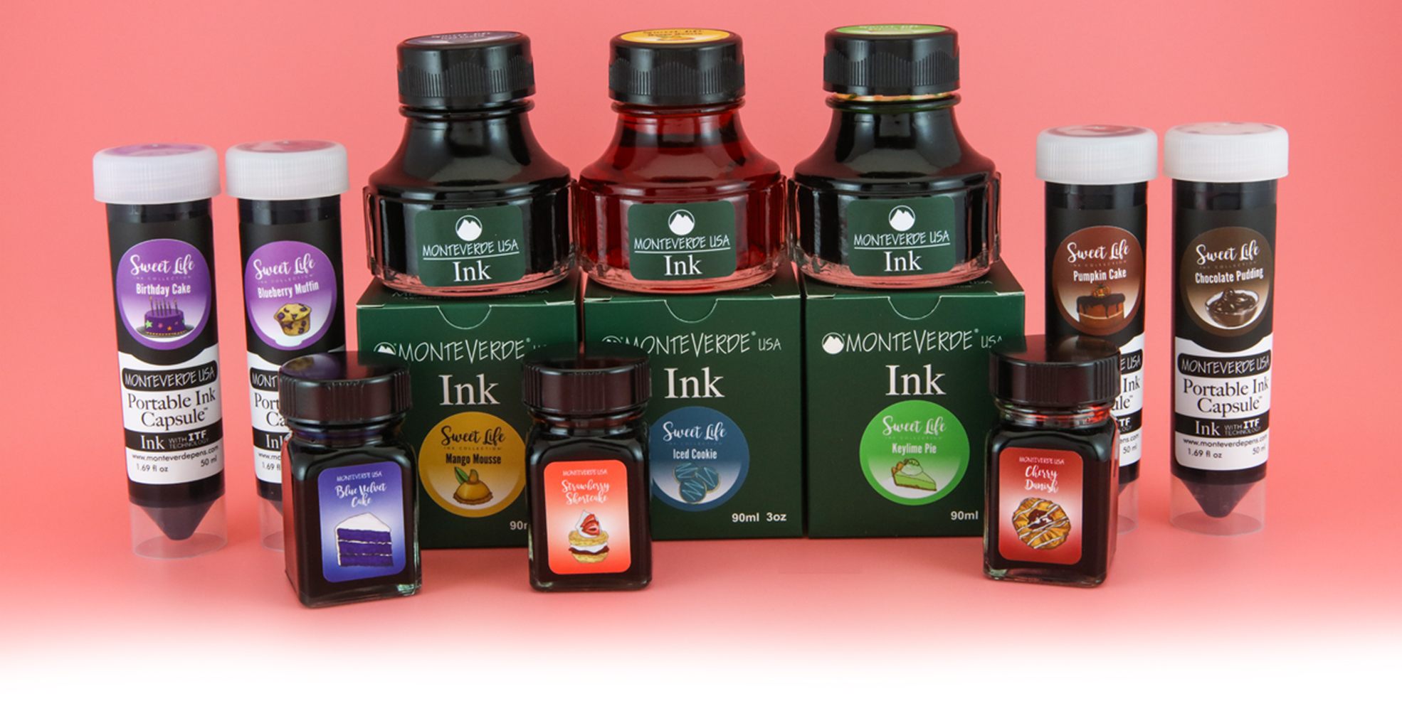
In the UK you could only buy this ink as part of the box set with the 30ml bottles, however the marketing photo above infers the Sweet Life inks were available separately including in 50ml ‘portable ink capsules’ and the standard 90ml Monteverde ink bottle..
Swab Comparisons
While I am not a fan of brown inks per se, I was not surprised with the number of swatches I could compare Chocolate Pudding with. There were more I could have used but did not, as the hue was not quite the same, normally with hints of orange.

My swatch of the Diamine ink is not the best, presumably with the ink taken from a near empty converter, however this set does show two very similar inks. I miss the days when Montblanc sold their ‘regular’ inks for comparative/competitive prices to Diamine and J. Herbin as they were really good value and generally high quality. Toffee Brown is a very well behaved ink, so if you do like the colour and do not have the set, else struggle to get Chocolate Pudding to work for you, then this is a solid, though now more expensive, performer.

These three inks are not quite the same as Chocolate Pudding, though all are available. I can not remember what the Caran d’Ache was like, however neither the ScriBo nor Campo Marzio inks are well behaved.

In natural light (as opposed to the harsh white of the scanner) these inks are closer, but still different (if that makes sense).
Cost

Originally this set would have been £90 in the UK, meaning £9 per bottle. This is actually about the normal price for a regular Monteverde ink meaning you are not paying extra for a limited edition. There are a number of problems this ink faces though. First it is comparatively expensive compared to the produce of Diamine and J. Herbin (regular line with the latter), though it also should be remembered Monteverde inks are a lot cheaper than the produce of Sailor, another brand with a large catalogue. Second, in the UK anyhow, it is hard to find any where selling Monteverde inks, never mind a limited edition from a few years back.
Views
I am not really a brown ink fan, however the original swabbing did make this ink seem interesting with the high variation in shading. When it came to actually write with the ink, things fell apart. Presumably due to a high level of viscosity, this ink struggles to flow and also to sit properly on paper. If you like it and can find it outside of the set I would suggest looking else where, with Montblanc Toffee Brown being a good alternative. One final thing, I found this ink to be an annoyance when cleaning. It was not the worst I have ever encountered, but it did require much more work than normal. Net result, I can not recommend this ink.
Tools Used
- The Well Appointed Desk Col-o-ring ink testing cards.
- Midori MD A5 paper (cream page writing sample).
- Black’n’Red Optik A5 paper (white page writing sample).
- Rhodia Dotpad No. 16 (drying tests).
- GoodINKPressions A5 Tomoe River 68 gsm paper (white paper, this ink blot test at bottom).
Pens Used
- Glass dip pen with the tip slightly smoothed (used the writing on the ink test cards).
- Franklin-Christoph 451 CDLI with a Mike Masuyama Needlepoint steel nib.
- OMAS 360 GM with a broad 18k gold nib.
- Franklin-Christoph 19 ‘1911’ with a broad SIG steel nib.
- Pelikan Pelikano with a starter/A steel nib (also used for the drying test and writing in the pocket book).
- Letter opener for the ink smear on the Tomoe River paper.
Written quotes from Neuromancer by William Gibson

Now I’m trying to imagine a Spotted Dick ink, emulating a pale, golden airy sponge dotted with raisins. Sounds like something which might be tried by Ferris Wheel Press or Colorverse. Totally impractical, of course. It’s easier to imagine a hand-dyed sock yarn called Spotted Dick – that light gold background with deep purple-brown splodges of dye. I’d like that.
Perhaps a non fountain pen pale yellow ink with large black particulate ? (and here s me who turned down a cherry bakewell and custard last night).
Pingback: Monteverde Sweet Life – Pumpkin Pie | dapprman