
Tags
A Night in Jodhpur, Blue Ink, Diamine, Diamine Ink, ink, Ink Review, Papier & Stift, Papier & Stift ink
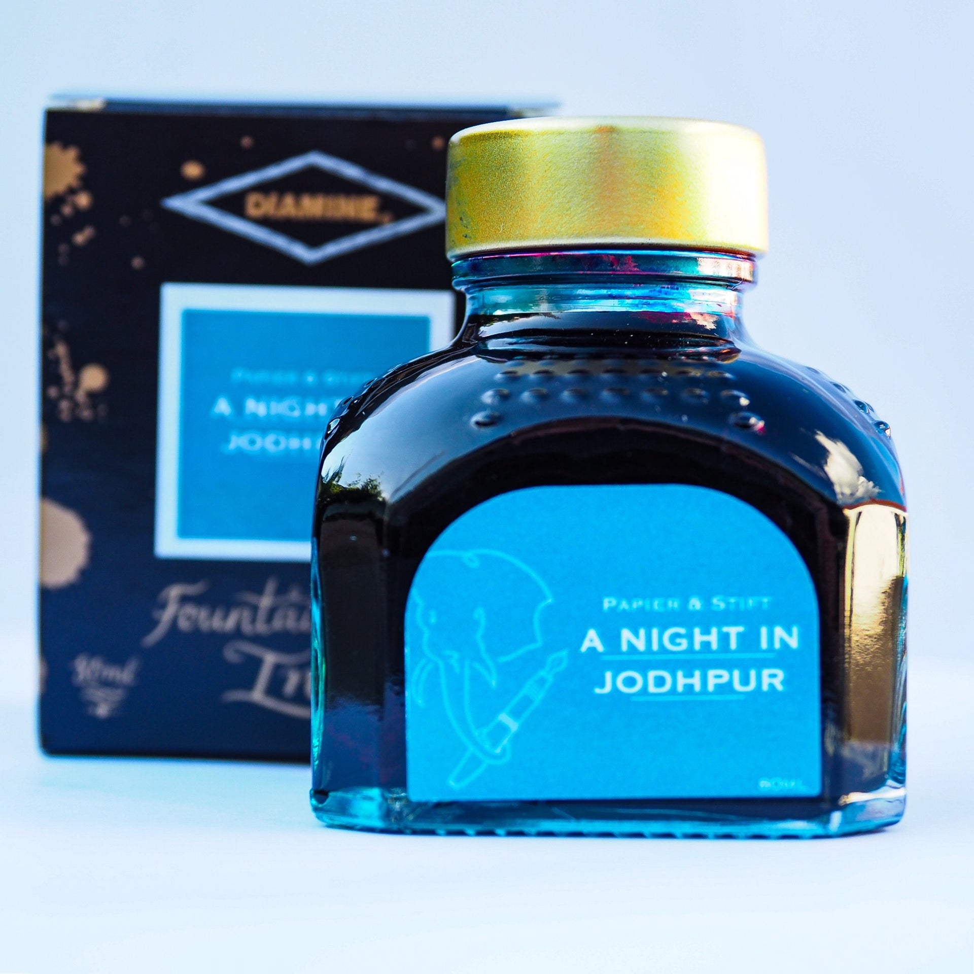
While new to me, A Night in Jodhpur has been out for quite a while with is being launched in 2019. An exclusive ink for the German stationary store Papier & Stift where it is an on going line, as opposed to a short term special edition.
I was given this bottle by Anja Gebler of Papier & Stift at the Spring 2024 London Pen Show.
Initial Impressions
A sheening blue ink with hints of both grey and green, almost moving towards a dusky teal.
Swabbing Impressions

First pass and the ink appears to be between a blue grey and a dark teal. Second pass and the ink moves towards a dark lilac, partly as a result of the sheen now starting to come through. The third pass and the colour darkens slightly more while we now see definite sheening around the edges. The fourth pass just widens the edge sheen.
Writing Impressions

On the Midori MD paper the Franklin Christoph needlepoint wrote well with quite a bit of sheen and/or shading. With the OMAS there was a decent amount of shading and surprisingly little sheen. The Franklin Christoph SIG nib initially was a little dry, but this I would suggest was down to the tuning on the nib as this level of flow was seen else where as well. There was some nice shading and also a little sheen. The Pelikan Pelikano did not overly enjoy this ink, but it was never that bad. It was a little dry with the writing and there was a little skipping on long strokes.

The Needlepoint really liked the combination of A Night in Jodhpur with the Black’n’Red Optik paper. Virtually all you see is sheen, yet there is no feathering, nor signs of excess ink. With the OMAS pen there is a lot of sheen, though still with the underlying colour being present. The SIG nib produced an interesting combination of base colour and sheen. Despite the size of the nib, the dryer nature of the tuning seems to work well here, though there were a couple of signs of skipping. This may well just have been down to me, not the ink/nib. The Pelikano wrote well. this was probably the best paper for it, again we see quite a lot of sheen.
I would suggest Oxford Optik paper works really well with this ink if sheen is your thing.

Normally it tends to be the Tomoe River paper that produces the highest levels of sheen, however with this ink the trophy goes to the Black’n’Red. It is only the Franklin-Christoph Needlepoint that produced heavy sheening, though here the writing still looked crisp. There were no issues due to the bleed through from the reverse side of the page. If you did not look closely, you would think the OMAS had produced a nice balance of shading and non-shading, it is only when you do look closely or shine a light on the page, do you realise the shade is actually sheen I rather like this. The dryer nature of the SIG nib resulted in a surprising lack of sheen, though the laid down line still had shade and character. Oddly the Pelikan struggled a little here with some skipping, no sheen and little shading.
With the ‘splodge’ you can see a some interesting shading, however what is interesting is the limits of the sheen. It is there, but only in the a few areas. There was some bleed through from the dark sheen area on the right.
Shading and Sheen
There is some shading with this ink, though really only on paper that does not like sheen and much of the time what you think is shading is actually subtle sheening.
While this is a sheening ink it is no where near as heavy as I was expecting from Diamine. You still see a lot of the underlying colour with many of the nib/paper combinations. The sheen colour is dark blue to deep purple.
Flow and Consistency
Perhaps because this is not a heavy sheening ink the flow is generally good and I have seen little signs of sticking in the converter, not only in the four pens used in this test but also in a pen I am already using with A Night in Jodhpur. In some respects it reminds me of an older school of sheening ink due to more base colour being visible, but then it is a 5 years old recipe. For me this is an advantage as personally I want to see ink colour with some shading/sheen, not just sheen.
Drying Times

A lot of sheening inks can be slow to truly dry. A Night in Jodhpur is not too bad. Sure it takes a few seconds, arguably the 5 test shows smudging from the start of the line, but the 10 second dry test smudge is just from the final ‘blob’ at the end of the line. I also saw this with the ‘splodge’ test on the Tomoe River paper.
Packaging
From the Papier & Stift Website.
The ink comes in the standard Diamine 80ml bottle and box, with the Papier und Stift logo on the bottle label. Out of the box there is no confusing this as being part of the regular Diamine Inks range due to the label.
Swab Comparisons
I decided to look for both sheen and non-sheen swabs.

Starting with a pair of Diamine inks. The base colour is very similar to both of these, with the Polar Glow being a little lighter. Sheen wise A Night in Jodhpur sits between the two, and arguably you could say the Pelham blue was actually non-sheening.

All three of the sheen inks I found swabs for are closer under natural light to A Night in Jodhpur than under the harsh white of the scanner. The Moonview is very close and as I personally strongly recommend not to use the RC range of Krishna inks in fountain pens (I have two bottles and have tried 3 other samples, all have caused flow issues and bad staining) this could be a very good alternative if Moonview was an ink that really appealed to you, though there is less sheening. The Blackstone and Monteverde inks are both greyer in nature, though again this could be a very good, alternative as neither are made any more (though you still might be able to buy Blue Velvet Cake).

Finally a comparison with a very similar ink with no real sheen. The KWZ ink is slightly greener.
Cost
A Night in Jodhpur is £10 for an 80ml bottle directly from Papier und Stift, the same price they sell all the other Diamine inks regardless of being collaborations, limited editions, or the regular lines.
Views

From Nick Stewart’s Website.
I must admit I rather like this ink. I’m not in to sheening and originally thought the underlying colour would be too grey for me, but not long before being given the bottle I bought (finally after procrastinating since I reviewed it) an Aratrum Calamus which I promptly inked up with A Night in Jodhpur. I am now seriously considering using this ink in one of my regular pens as well, either at home or the office. Thing is I am not a sheen fan, but I do like it in small quantities where effectively it is acting as shading where lines cross and ink pools, and such is my experience so far.
Tools Used
- The Well Appointed Desk Col-o-ring ink testing cards.
- Midori MD A5 paper (cream page writing sample).
- Black’n’Red Optik A5 paper (white page writing sample).
- Rhodia Dotpad No. 16 (drying tests).
- GoodINKPressions A5 Tomoe River 68 gsm paper (white paper, this ink blot test at bottom).
Pens Used
- Pure Pens glass dip pen with the tip slightly smoothed (used the writing on the ink test cards).
- Franklin-Christoph 451 CDLI with a Mike Masuyama Needlepoint steel nib.
- OMAS 360 GM with a broad 18k gold nib.
- Franklin-Christoph 19 ‘1911’ with a broad SIG steel nib.
- Pelikan Pelikano with a starter/A steel nib (also used for the drying test and writing in the pocket book).
- Letter opener for the ink smear on the Tomoe River paper.

I like that color and I’m glad the sheen is minimal. I am not familiar with that ink, hopefully, I can find it domestically.
I had not heard of this ink before, but aside from the sheen, the colour appears very close to Diamine’s Gibson guitar series Pelham Blue, as you showed in your swatches. Being happy without sheen, I am content that Pelham Blue will do for me.
My swatch of Pelham Blue might actually have been from your bottle.
Pingback: London 2024 Spring Pen Show | dapprman
Pingback: Daily Carry – May 2024 Edition | dapprman