
Tags
Green Ink, ink, Ink Review, Key Lime Pie, Monteverde, Monteverde Inks, Monteverde Key Lime Pie, Monteverde Sweet Life
As a Brit I suspect only an American ink company could come up with using Key Lime Pie as an influence for a colour. I am not even sure I quite know what it tastes like, however with my sweet tooth I suspect I would like it.
Initial Impressions
A bright green ink, more reminiscent of apples than limes, with good levels of flow. Additionally it appears to provide decent levels of shading.
Swabbing Impressions

The first pass of the swab indicates that this might be a dryer ink than I first expected, however I think it is just light with shading. A second pass does not add that much, just a little darkness, so perhaps the fact we see the texture of the card may actually be down to this ink being too wet. The third and fourth passes are a lot darker and close to the colour I would associate with a lime (where as the lighter green to me is closer to an apple).
Writing Impressions

On the Midori MD paper this ink worked well. This is my second review of inks from this set and it was interesting to note so far they seem to provide a nice level of lubrication meaning the needlepoint nibbed pen glided across this paper with a smoothness that made you think you had medium or broad tipping. There was even some shading in the writing it produced. There was a little feathering with the broad OMAS nib and gaps in letters, such as a and e, were at times filled. It may be this ink is just a little too wet for this type of ink on paper of this type. The Franklin Christoph nib worked well with a nice level of ink flow from this traditionally drier nib, though there is still a little feathering. The Pelikan produced nice writing with a nice balance of shading.

On the Black’n’Red Optik paper three of the pens wrote well, however the broad OMAS nib put down too much ink. There is little feathering, however the letters look a little squashed as the ink has spread out on the surface of the paper. The Franklin Christoph SIG nib produced a nice level of shading and the other two pens wrote well.

It can be of no surprise that the OMAS put too much ink down on the Tomoe River paper, well for my tastes anyhow. The other pens still worked well with this ink on this paper. The ink smear at the bottom is attractive and shows a good range of shading.
Shading and Sheen
I do like the variation in shading with Key Lime Pie. There is a nice balance between a lighter apple green and that of a lime. It does show with the dryer nibs, as with the OMAS too much ink is put down on the shinier paper types and on the Midori MD the feathering can reduce the effect of the colour variation.
This is not a sheening ink.
Flow and Consistency
This is a really wet ink once it starts to flow. I say once as it did take a while for most of the nibs to prime, but once that had occurred the ink ran well. Except that is with the OMAS where there was too much ink. I think Key Lime Pie may be unsuited to wet nibs due to this, though it could be ideal if you have a pen that normally struggles due to dryness.
Drying Times

Considering how well this ink flows I was surprised just how quickly it dried. This could be a good ink option for left handers.
Packaging
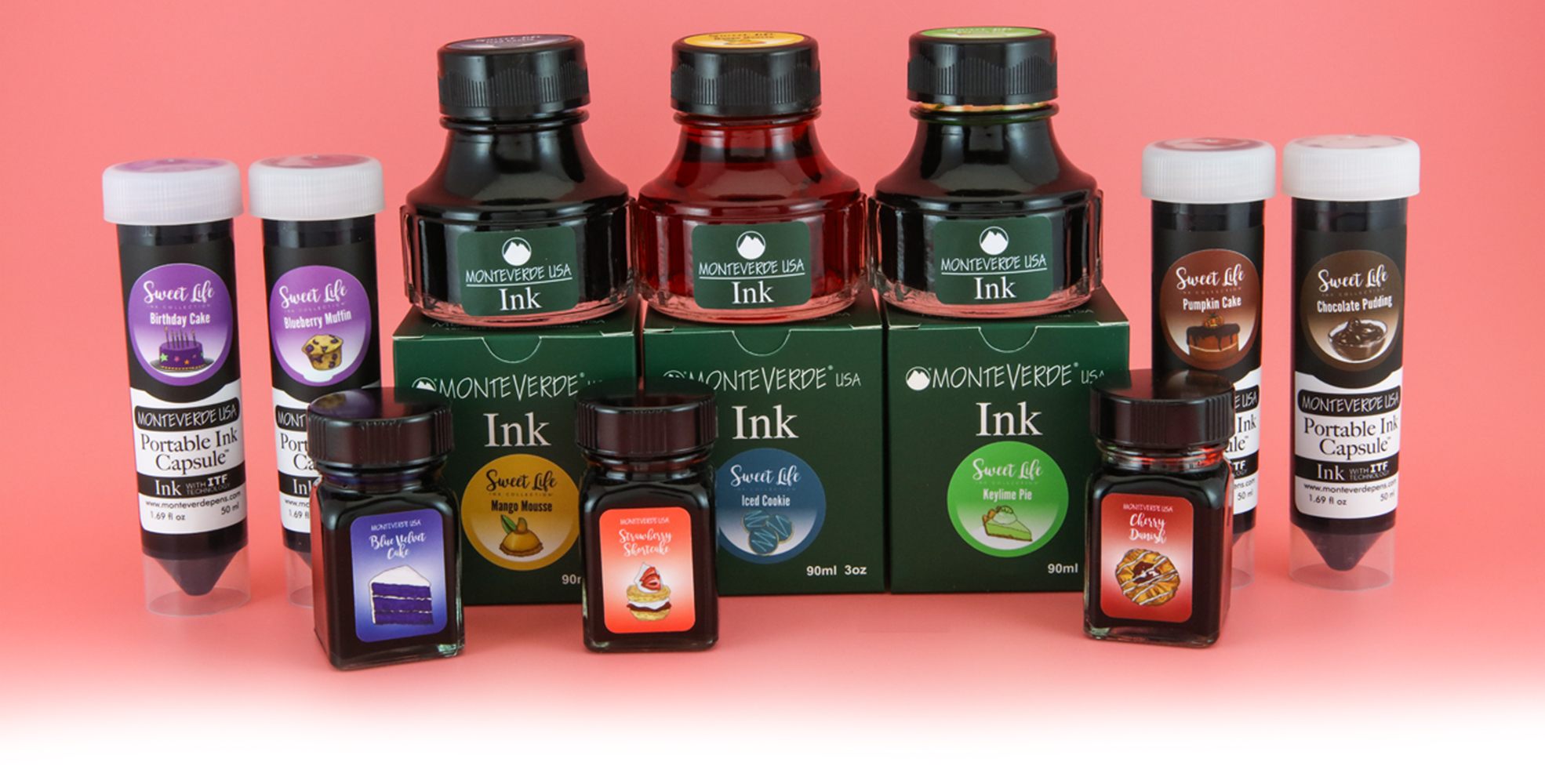
In the UK you could only buy this ink as part of the box set with the 30ml bottles, however the marketing photo above infers the Sweet Life inks were available separately including in 50ml ‘portable ink capsules’ and the standard 90ml Monteverde ink bottle..
Swab Comparisons
As might be expected, I did not have that many inks to compare this with, in fact two of them I sampled in the last few months.

These four inks are similar, though at different points on the swatch. It is closest to the ScriBo ink, however that is darker when it comes to the writing sample.
Cost

Originally this set would have been £90 in the UK, meaning £9 per bottle. This is actually about the normal price for a regular Monteverde ink meaning you are not paying extra for a limited edition. There are a number of problems this ink faces though. First it is comparatively expensive compared to the produce of Diamine and J. Herbin (regular line with the latter), though it also should be remembered Monteverde inks are a lot cheaper than the produce of Sailor, another brand with a large catalogue. Second, in the UK anyhow, it is hard to find any where selling Monteverde inks, never mind a limited edition from a few years back.
Views
As a whole I really like this ink though I was a little disappointed with the results with the broad OMAS nib, which is wet in nature. If you like brighter greens and have a pen or two that struggle with ink flow then Key Lime Pie may work well for you, if you can buy a bottle/vial by itself.
Tools Used
- The Well Appointed Desk Col-o-ring ink testing cards.
- Midori MD A5 paper (cream page writing sample).
- Black’n’Red Optik A5 paper (white page writing sample).
- Rhodia Dotpad No. 16 (drying tests).
- GoodINKPressions A5 Tomoe River 68 gsm paper (white paper, this ink blot test at bottom).
Pens Used
- Glass dip pen with the tip slightly smoothed (used the writing on the ink test cards).
- Franklin-Christoph 451 CDLI with a Mike Masuyama Needlepoint steel nib.
- OMAS 360 GM with a broad 18k gold nib.
- Franklin-Christoph 19 ‘1911’ with a broad SIG steel nib.
- Pelikan Pelikano with a starter/A steel nib (also used for the drying test and writing in the pocket book).
- Letter opener for the ink smear on the Tomoe River paper.
Written quotes from Neuromancer by William Gibson

Pingback: Monteverde Sweet Life – Chocolate Pudding | dapprman