
Tags
ink, Ink Review, Maroon Ink, Purple Ink, Red Ink, Rosso Chianti, SCRIBO, ScriBo Ink, Scribo Rosso Chianti
ScriBo have managed to do what so few other ink makers have managed. To use the name or type of a wine and match it to an appropriate colour. Most the usual offerings would be poured straight down the sink without even tasting if provided in traditional 70cl bottles, but here we have an ink that makes you think about pizza and pasta. Perhaps I just think too much with my stomach.
Initial Impressions
A pink tinged ink bordering some where between red, maroon, plum, and purple. The initial swab test showed it to potentially be a wet ink with some decent shading.
Swabbing Impressions

This is quite a saturated ink. The first pass put down a nice layer of colour, also indicating this may be a wet ink. The second pass moves the colour on to a shade of maroon, then the third pass reaches the limit of depth, as you will struggle above to see where the fourth pass was made. At the edges of the later swipes you can see some darkness, but this does not appear to me to be sheen.
Writing Impressions

On the Midori MD paper the writing experience was quite enjoyable. The ink flows well with all of the pens, however on this paper you can see the difference between wet and dry nibs. Certainly here it is an interesting colour and for me looks best in the writing sample from the juicy broad 18k OMAS GM nib.

On the Oxford Optik paper the resultant writing samples are a lot deeper in saturation and colour than with the Midori MD. There is still a difference with a wet nib and personally I rather like the results.
Shading and Sheen
This ink exhibits a nice level of shading. Depending on how wet and large the nib is depends on what you can see, but on both paper types above you can see hues ranging from darker pinks through to maroon and even plum.
This is not a sheening ink.
Flow and Consistency
With quite a few of the ScriBo inks I’ve presently tried being dry, I have been pleasantly surprised by this one. It shows wet behaviour, but not overly so. It is also well behaved in converters, so no sticking to the sides. Note this was the 6th ink out of the 13 I had tried at the time of writing.
Drying Times

This is a relatively wet ink, but not one that will have you reaching for the blotting paper unless you are about to turn a page or pass a note straight into some one else’s hand.
Packaging
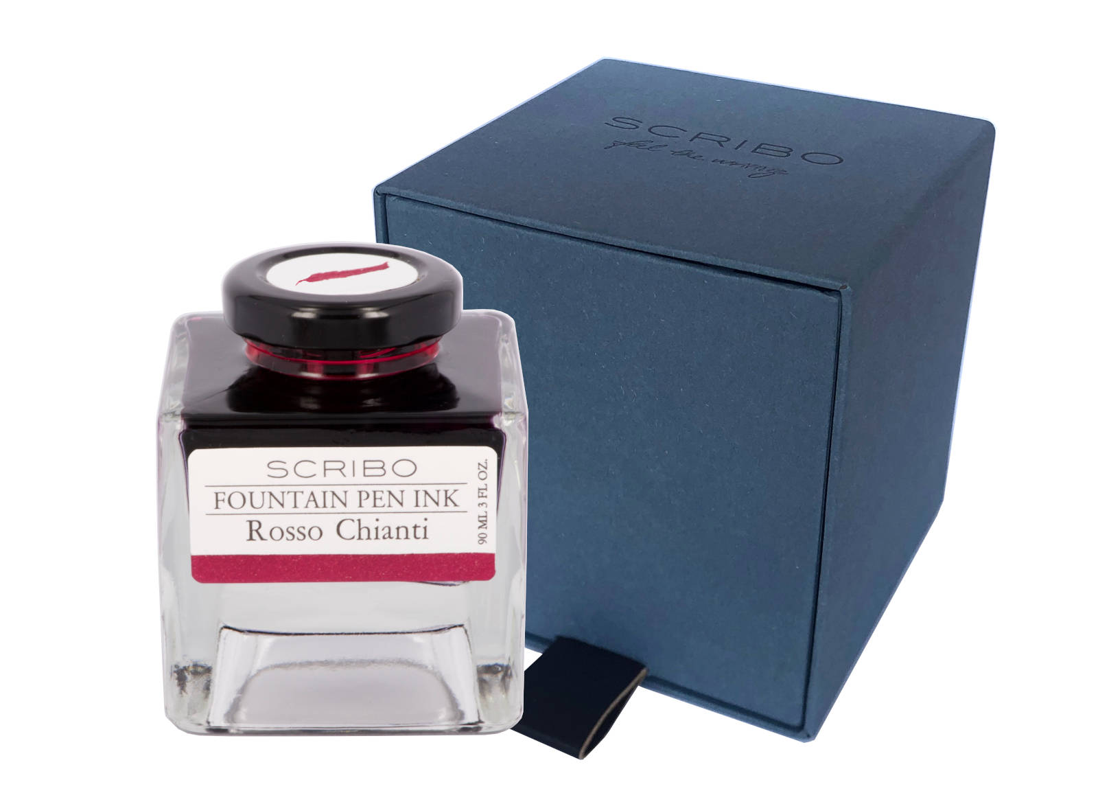
While I only have a sample vial of this ink you can see from the above picture that it normally comes in a four sided glass bottle which holds 90ml. Thought has obviously gone in to the design of these bottles with the view that the owners may keep them in boxes or draws for not only do the bottles neatly and safely stack upon one another but the cap comes with a label showing a good representation of the ink contained within. The front label also shows the colour, which could be useful once the bottle is near empty.
Swab Comparisons
I was surprised how difficult it was to find swab tests to compare Rosso Chianti with. I must have over 50 red/pink and purple/maroon cards, yet struggled to find anything close. This does bode well for the ink as it means there is less out there which it might have to compete with.

The only one I had in my set of red swabs was from Caran D’Ache, but while the darker parts of the writing are similar, you can see it is too pink in comparison with the ScriBo ink.

Here we can see a comparison with two similar colours when it comes to the writing, but both have more pink in their hues. The De Atramentis ink is also rather dry.

The two inks I am comparing Rosso Chianti with here have brown tinges to them. Both display darker writing, and again do not quite match.

This comparison is actually quite interesting where you look behind the sheen of the Robert. The inks look very similar as far as I can tell. Alas a sheen monster is not a suitable comparison for Rosso Chianti, but it does make me wonder if Diamine do produce a similar ink to the ScriBo one.
Cost
At £35 for 90ml this is reasonably priced for a luxury ink. Slightly more expensive then Pelikan Edelstein, regular Montblanc, and Graf von Faber Castell, but also slightly cheaper than Pilot Iroshizuku and Sailor Manyo. Sailor Shikiori and non-base Montblanc inks are considerably more expensive.
Thing is, as with most 50ml+ size bottles, you are not going to run out of ink any time soon, in fact you will probably not be looking to replace a bottle of this size for years unless you are a prodigious writer with just a couple of bottles.
Views
I’ll admit it, I’ve fallen for this ink. I normally do not like this sort of shade, especially if there are hints of pink, but the more I wrote with Rosso Chianti the more I liked it. It is similar enough to Kyo-Noto Adzukiro for me to save my money for the moment, however once that bottle is finished I may well buy the ScriBo ink instead of replacing the TAG one.
Tools Used
- The Well Appointed Desk Col-o-ring ink testing cards.
- Midori MD A5 paper (cream page writing sample).
- Oxford Optik A5 paper (white page writing sample).
- Rhodia Dotpad No. 16 (drying tests).
Pens Used
- J. Herbin glass dip pen with the tip slightly smoothed (used the writing on the ink test cards).
- Franklin-Christoph 451 CDLI with a Mike Masuyama Needlepoint steel nib.
- OMAS 360 GM with a broad 18k gold nib.
- Franklin-Christoph 19 ‘1911’ with a broad SIG steel nib.
- Pelikan Pelikano with a starter/A steel nib (also used for the drying test and writing in the pocket book).

Pingback: Pens in Daily Use December 2022 | dapprman
Pingback: Pens in Daily Use April 2023 | dapprman