
Tags
Cult Pens, Cult Pens Exclusive, Cult Pens Flower Inks, Cult Pens Lotus, Diamine, Diamine Ink, ink, Ink Review, Lotus, Lotus Ink, Pastel, Pastel Ink, Pink Ink
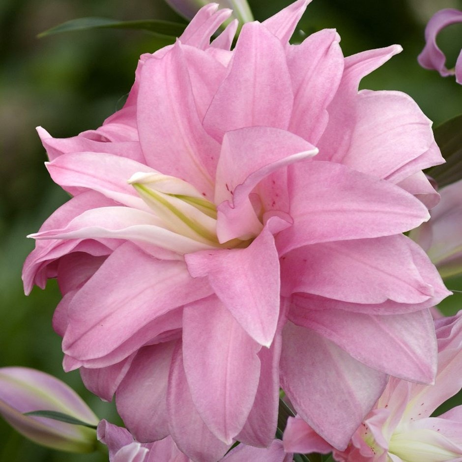
For a number of religions this is a flower associated with the Gods, resulting in pictorial depictions of Lotus Thrones. An aquatic plant found across Asia, meaning alas what we get in the UK outside of botanical gardens is but a form of lily bred for a similar looking flower.
Initial Impressions
A pastel pink, almost a flesh tone. The lightness of the ink may mean it is not as dry as I initially thought.
Swabbing Impressions

The first pass of the swab produced a pale washed out flesh colour. The second pass resulted in the tones I would expect of strawberry blancmange or Western art for pale flesh (yup I know not related). The third pass produced a colour close the petals in the top picture. Oddly the fourth pass appeared to wash out the contrast slightly, while at the same time producing a dark outer line.
Writing Impressions

On the Midori MD paper the Franklin Christoph needlepoint nib wrote relatively well and is surprisingly legible considering the swatching. The OMAS worked from the off with some shading. Alas the resultant writing was just two tone with the lighter variant being too light, almost making it look like the pen was skipping. In addition where the ink is heavier there is feathering. The Franklin Christoph SIG nib struggles with this ink, resulting in pale writing. It also struggled with flow at first and needed the nib to be re-primed. I think in advance I always realised the Pelikan would struggle with this ink and in that I was correct with some of the lettering being barely visible.

The Oxford Optik paper did result in some surprises. Normally it produces the best results with all the pens yet here I actually found the Franklin Christoph needlepoint to feel a little dry with more feedback than on the Midori MD paper. Not what I would expect. The OMAS worked well with less feathering and fewer light patches, which was good as the writing is still just two tone. The Franklin Christoph SIG nib again struggled with the ink flow and while its results were darker on this paper there are still areas bordering on skipping. The Pelikan showed improved performance on this paper, but as before the writing is too light to me for it to be usable.

The Franklin Christoph needlepoint was better behaved with Tomoe River and possibly produced its best results on this paper. The OMAS pen produced less shading than before, though here there was more variation. Still the light parts are hard to see unless looked at closely. The Franklin Christoph SIG and Pelikan Pelikano were hit and miss, no near skipping, but too much light ink to make the writing from both pens comfortable to read.
Shading and Sheen
The amount of shading that Lotus provides is very dependant on the paper type. The issue is the lightest hues are hard to read and I find make much of the writing samples to be hard on the eyes.
This is not a sheening ink.
Flow and Consistency
From above you will realise there are flow issues with this ink. It does not appear to be that viscous as it can be moved around in the converter without the need of too much shaking, however I think it is comparatively thick ink in nature and that is where the issues lie. This results in slower ink movement and limiting of the flow through even the OMAS nib.
Drying Times

Lotus is actually a relatively wet ink despite the ink flow issues. While there is no smudging on the 10 second test, there is a little on the 5 second one.
Packaging

While I only have a sample vial of this ink you can see from the above picture that it normally comes in a square bottle that contains 30ml of ink. Having handled one before, they work very well from a presentation point of view, but are not great for filling a fountain pen.
Swab Comparisons
I have few swatches that are near to Lotus. I know there are other flesh coloured inks out there such as the Herbin 1670 Nude. I did manage to find a couple, though controversially one is from the same set of inks.

OK neither of the other two inks are that close but they do share similarities in all being pale, pink, pastel flesh colours. If Lotus is a colour you do like then I am not sure you are going to find many alternatives out there. Sure Sailor might have something in their Studio range, but at a cost.
Cost
At present these 30ml bottles cannot be bought individually, but only as part of the Cult Pens set of ten. This comes in at £60 or £6 per bottle, which for most inks is cheap, however compared to other Diamine inks this is a little more expensive. Having said that, I suspect that in 6-12 months time you will be able to buy 30ml plastic bottle ‘refills’ at the regular Diamine price of £4.50. I think they have done this on all their non-Inkvent released ink sets so far.
Views
I think Lotus is one of those inks where you need to really want the colour to be willing to use it, and by that I think it has limited scope. If/when sold separately I can not see it selling particularly well. It does work in fountain pens, but not well and even in a wet pen there are too many overly light areas for the writing to be acceptable. Like many of the other inks in this set, I think this is one really just for artists.
Tools Used
- The Well Appointed Desk Col-o-ring ink testing cards.
- Midori MD A5 paper (cream page writing sample).
- Oxford Optik A5 paper (white page writing sample).
- Rhodia Dotpad No. 16 (drying tests).
- GoodINKPressions A5 Tomoe River 68 gsm paper (white paper, this ink blot test at bottom).
Pens Used
- J. Herbin glass dip pen with the tip slightly smoothed (used the writing on the ink test cards).
- Franklin-Christoph 451 CDLI with a Mike Masuyama Needlepoint steel nib.
- OMAS 360 GM with a broad 18k gold nib.
- Franklin-Christoph 19 ‘1911’ with a broad SIG steel nib.
- Pelikan Pelikano with a starter/A steel nib (also used for the drying test and writing in the pocket book).
- Letter opener for the ink smear on the Tomoe River paper.
