
Tags
Blue Black Ink, Blue Ink, Blue Velvet, ink, Ink Review, Monteverde, Monteverde Blue Velvet, Monteverde Inks, Monteverde Sweet Life
I am not sure when I last had a piece of Blue Velvet cake. It is available in the UK, though not that common and it also may have come across from the US. I suspect, for many Brits of my generation, mention Blue Velvet and you think of the classic David Lynch movie. I think this is why I kept forgetting the ‘Cake’ in the name when testing this ink.
Initial Impressions
A blue-black/blue-grey ink which might be on the dryer side and which sheens while still showing its true colour.
Swabbing Impressions

The first pass of the swab shows Blue Velvet Cake to be more of a blue-grey ink than blue-black, though you can also see a hint of green. I actually thought this ink would be dryer than it turned out to be. The second pass really darkened the ink and started to show areas of red. The third pass does not deepen much but the red now becomes much more sheen like. The fourth pass introduces yet more sheen, but at the same time only on the edges.
Writing Impressions

It is interesting to note that on the Midori MD paper I actually see a little sheen, or at least hints of it with the needlepoint nib. It puts a lot of ink down and possibly the lettering is a little wider as a result, certainly it is more saturated than I would expect. The actual feel of the nib is good, but nothing special, so the amount of ink going down is not excessive. The OMAS produces some interesting shading and small areas of red, though not really any sheen. There was the expected feathering, but not to a great level. With the Franklin Christoph SIG nib there is some rail roading on downward strokes, though this broad nib is naturally dry and so it may just be showing the limits of flow with this pen, hinting it may be better with a more neutral or wet nib (note after this set of tests I put all the nibs through a cleaning program using my sonic cleaner). The Pelikan seemed to struggle slightly with the ink. It wrote, but the produce is light, hinting possible flow problems.

I was surprised by the lack of sheen with needlepoint nib on the Black’n’Red Optik, despite its results on the Midori MD. It did write well with the line being thinner, more what I would expect. The writing from the OMAS was cleaner than before, however gaps within letters were now being filled. I was expecting some sheen here, but none was present. The SIG nib showed the same rail roading as before, but otherwise on the Optik paper it produced better writing. The Pelikano still seemed to struggle and there was some skipping present.

All four pens produced their best results on the Tomoe River paper, though you still see rail roading with the SIG. The splodge of ink at the bottom shows just what a range of shades this ink can produce and there is also an appropriate velvet texture to be seen. Sheen can be seen in multiple locations, especially the right, where the ink pooled.
Shading and Sheen
Blue Velvet Cake can produce an interesting range of shading, however I do find it to be limited with each sample. A couple of shades for a wet nib, a couple of different ones for a dry nib.
Blue Velvet Cake does produce sheen in limited quantities, though it part depends on your definition as you get the red tints and edges before they start to look metallic.
Flow and Consistency
While not as dry an ink as first expected, Blue Velvet Cake does appear to be that way and also has a slight viscosity to it. None of the pens failed to write due to ink flow but you can see signs of struggling to get enough ink on the SIG and the Pelikano.
Drying Times

Despite being a dryer ink as far as flow is concerned, this is not the case when it comes to being able to smudge your writing. Even on the 10 second test there is some smearing.
Packaging
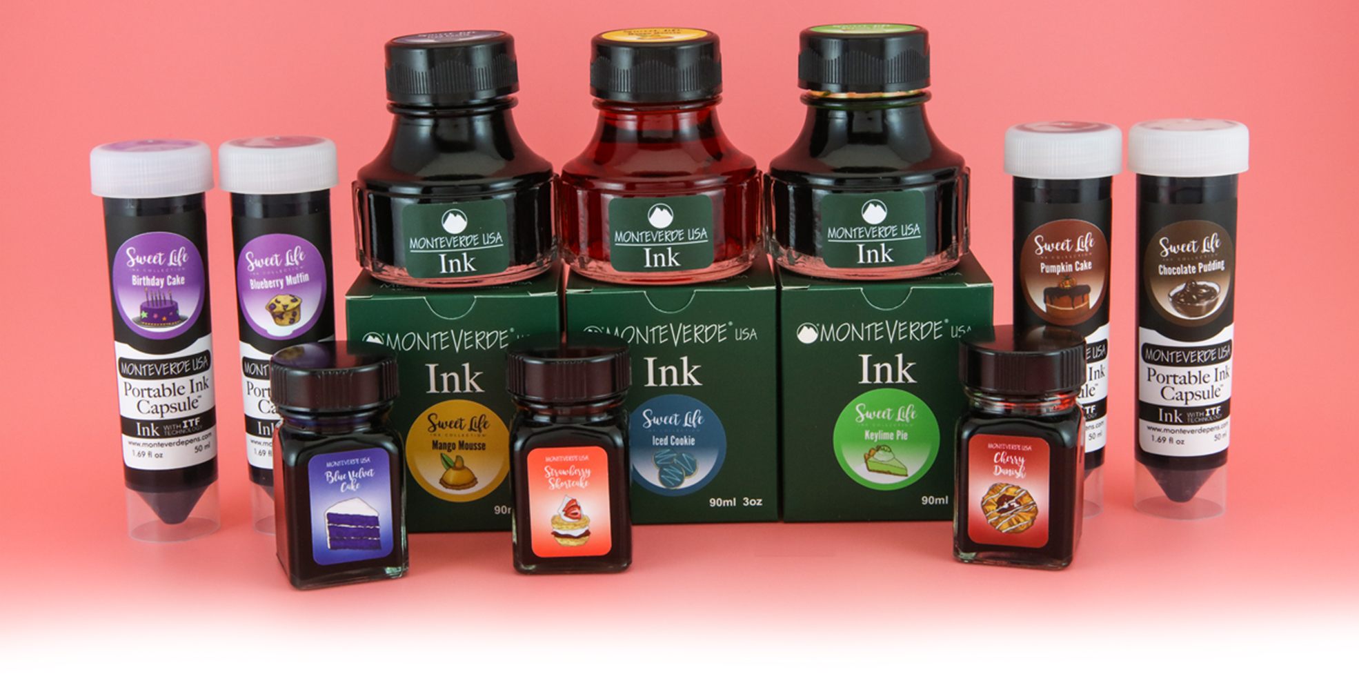
In the UK you could only buy this ink as part of the box set with the 30ml bottles, however the marketing photo above infers the Sweet Life inks were available separately including in 50ml ‘portable ink capsules’ and the standard 90ml Monteverde ink bottle..
Swab Comparisons
As might be expected, I did not have that many inks to compare with Blue Velvet Cake.

This set show both good news and bad news to fans of the late lamented Blackstone Sidney Harbour Blue. The inks are very similar in appearance, levels of sheen, and … problems for dryer nibs. Alas it is also moot as you’ll now struggle to Blue Velvet Cake, especially outside of the set. The Diamine Christine (Chrissie for the smaller bottle of the same ink) is not far off, slightly more green in tint, and far heavier on the sheen, especially once you look at the writing.

Here are two more alternatives. The Robert Oster looks close in natural light, though under the harsh white of the scanner it is a lot lighter and greyer except in the most concentrated areas. The Diamine ink is a bit too blue.
Cost

Originally this set would have been £90 in the UK, meaning £9 per bottle. This is actually about the normal price for a regular Monteverde ink meaning you are not paying extra for a limited edition. There are a number of problems this ink faces though. First it is comparatively expensive compared to the produce of Diamine and J. Herbin (regular line with the latter), though it also should be remembered Monteverde inks are a lot cheaper than the produce of Sailor, another brand with a large catalogue. Second, in the UK anyhow, it is hard to find any where selling Monteverde inks, never mind a limited edition from a few years back.
Views
Blue Velvet Cake is an interesting ink if you have a wet enough nib, however I think it needs to be a colour you really want to use. Sure if you have the Sweet Life ink set then it is an acceptable ink in the right pen, but I would struggle to recommend buying this by itself unless you were looking for a Sidney Harbour Bridge replacement.
Tools Used
- The Well Appointed Desk Col-o-ring ink testing cards.
- Midori MD A5 paper (cream page writing sample).
- Black’n’Red Optik A5 paper (white page writing sample).
- Rhodia Dotpad No. 16 (drying tests).
- GoodINKPressions A5 Tomoe River 68 gsm paper (white paper, this ink blot test at bottom).
Pens Used
- Glass dip pen with the tip slightly smoothed (used the writing on the ink test cards).
- Franklin-Christoph 451 CDLI with a Mike Masuyama Needlepoint steel nib.
- OMAS 360 GM with a broad 18k gold nib.
- Franklin-Christoph 19 ‘1911’ with a broad SIG steel nib.
- Pelikan Pelikano with a starter/A steel nib (also used for the drying test and writing in the pocket book).
- Letter opener for the ink smear on the Tomoe River paper.
Written quotes from Neuromancer by William Gibson

Thanks for the review, The more I use a variety of inks, pens and paper the more differences that arise. Using the same ink on a variety of amazes me. Also there are consitant differences when using the same ink and paper but a stainless nib vs a 14k nib.